
Herne Hill Art Museum App
January 2025
As part of my Google UX Design Professional Certificate, I undertook a project based on a prompt. This opportunity allowed me to build on my fundamental UX Design skills and apply my knowledge thus far to a tangible project.
my prompt
"Design an app and a responsive website for a public art museum to advertise exhibitions and events, provide museum information to patrons and enable patrons to schedule visits"
My goals for this project were to:
Build on the fundamental skills of the UX Design framework (empathise, define, ideate, prototype and test);
Be able to navigate Figma efficiently and also prioritise accessible design consistently.
Due to problems I encountered with finding public domain art on existing museums' websites, I based my app off of a hypothetical public art museum. This also allowed me to maintain my focus on solving my users' problems and building my UX Design skills.
following the ux design framework…
empathise and define
Interview goals:
Gain an understanding of the behaviour behind visitors of art museums
a. Discovering how individuals seek out information on exhibitions/events/museums in the first place and their key considerations when selecting
Learn how people utilise websites and apps of art museums
a. What key information do they pay attention to?
b. What are problems they encounter?
I wanted to consider the experiences, needs and pain points of these users. My sample of interviewees included students, young professionals as well as retired individuals with varying interests (regarding the museums and exhibitions they prefer). The interview questions were also translated into Turkish to better accommodate two participants.
Aggregated empathy maps and user personas were created with the findings.
User personas:


Main takeaways from interviews:
Users struggle to find sufficient information on exhibitions/events prior to booking; this leads to disappointment as expectations do not always align
Users struggle to access the information available at art museums
Users do not get to be spontaneous or flexible with booking exhibitions/events
To determine the issues at hand, I created specific problem statements for each user persona as part of the Define stage:
Kemal is a university student who needs sufficient information on exhibitions because he wants to go to exhibitions worth his time and money
Sahana is a retired financial advisor who needs easy-access information at exhibitions because she wants to have a fulfilling experience in real time
Drew is a full-time consultant who needs the option to arrange spontaneous visits because they want some flexibility and cannot always book events months in advance
It should be noted that some of the frustrations expressed were related more directly to the physical layout of museums (e.g. floorplan, lighting). These are not necessarily things my app had direct control over, however, I wanted to use this as an opportunity to explore how my app could assist in minimising the negative impact of these issues and make the museum experience more accessible.
Almost all participants expressed a desire to visit museums more frequently but mentioned that time and money were prominent constraints. Thus, it was important that when they did have the time or budget to visit a particular exhibition, it would be worth the expense.
Goal statement:
My Herne Hill Art Museum app will let users efficiently book exhibitions they will be content with which will affect museum visitors with limited time and money by providing sufficient information on exhibitions, preventing disappointment.
We will measure effectiveness by analysing exhibition attendance and reviews.
starting to ideate
Competitive audit
I conducted a competitive audit to identify gaps in the market and familiarise myself with the booking process for museum visits. Most significantly, there is a notable gap in the market for an art museum app where users can book visits, a function that appears reserved to museums’ websites. The only relevant app I found - the Tate Modern app - seems to have been minimally updated since COVID-19 and lacks a booking function.
A competitive audit on museum websites revealed that:
Many museums include exhibition videos and some provide previews of the pieces on show; information is still relatively minimal (when referring to my findings of what visitors consider when planning a visit)
Many museums allow for customised search and filtering options to accommodate for specific dates, prices or topics
HMW - coming up with solutions
I completed a 'Crazy Eights' exercise for each user persona and their respective problem statement.

Personal Reflection:
This exercise proved to be more difficult than anticipated as I struggled to not get caught up in the details. It helped to approach all of my potential solutions with an open mind and I definitely found it easier after the first few attempts. I got to build on initial ideas as well as come up with new ones on the spot as I was drawing
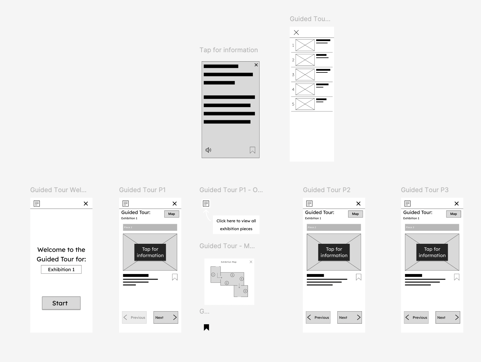
Guided Tour idea - Bloomberg Connects competitive audit
One of the ideas that arose from my 'Crazy Eights' exercise was a 'Guided Tour' feature which would provide users with a mobile guide for any exhibition they are visiting in real time. It would also include customisable accessibility features such as increasing text size of artwork descriptions, audio recordings and a 'save' feature, so users can return to pieces in their own time and do further reading if desired.
I also carried out personal visits to the Dulwich Picture Gallery and the Horniman Museum in south London with the aim of ensuring I do not exclude critical features of art museums that users may expect. During a visit, I discovered the Bloomberg Connects app which provides free museum guides to hundreds of museums worldwide. A competitive audit revealed that:
Bloomberg Connects is relatively easy to navigate and can be a valuable addition to visitors’ museum experiences
Not all artworks have descriptions on the app
Although audio descriptions available, difficult to find a way to increase text size on descriptions I could access with limited customisation options
I wanted to incorporate a mobile guide into my museum’s app alongside booking options to create a ‘one-stop-shop’ for visitors.
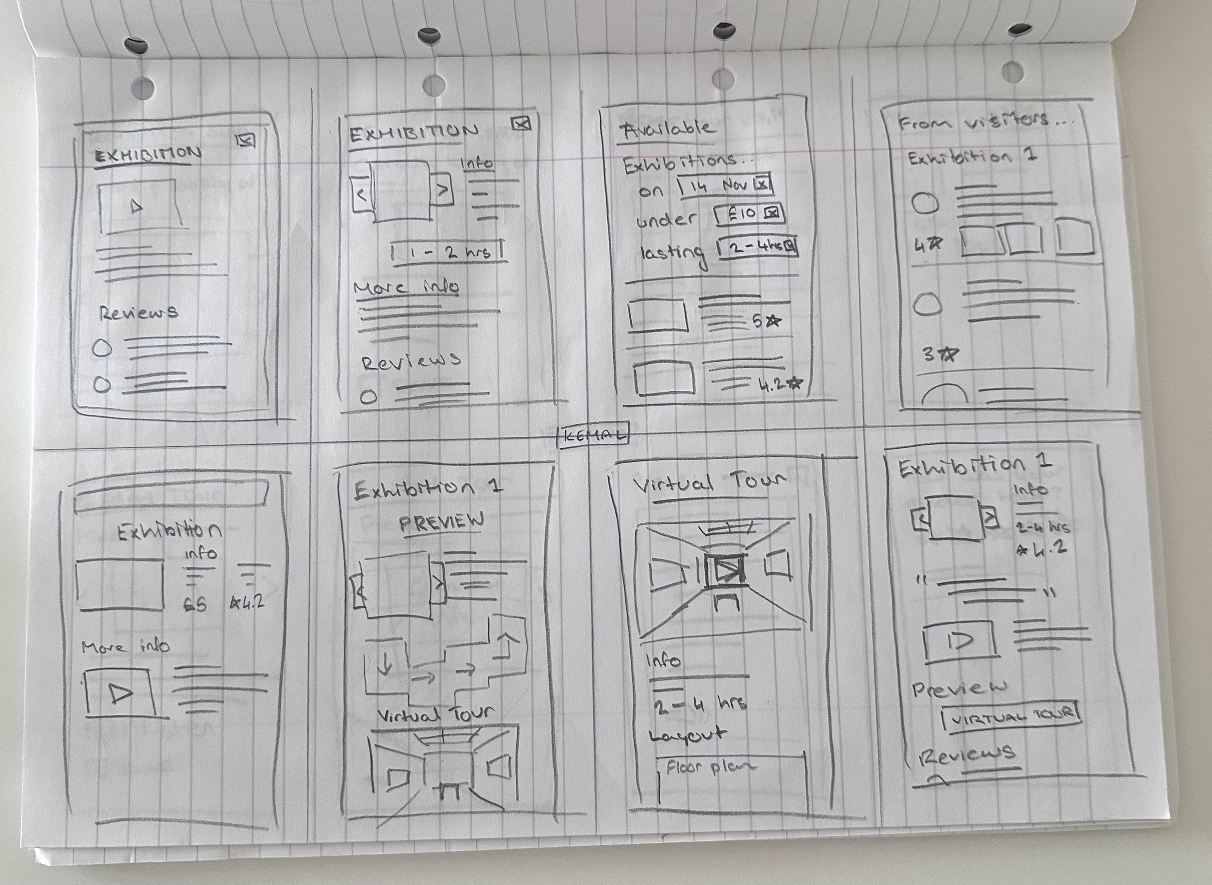
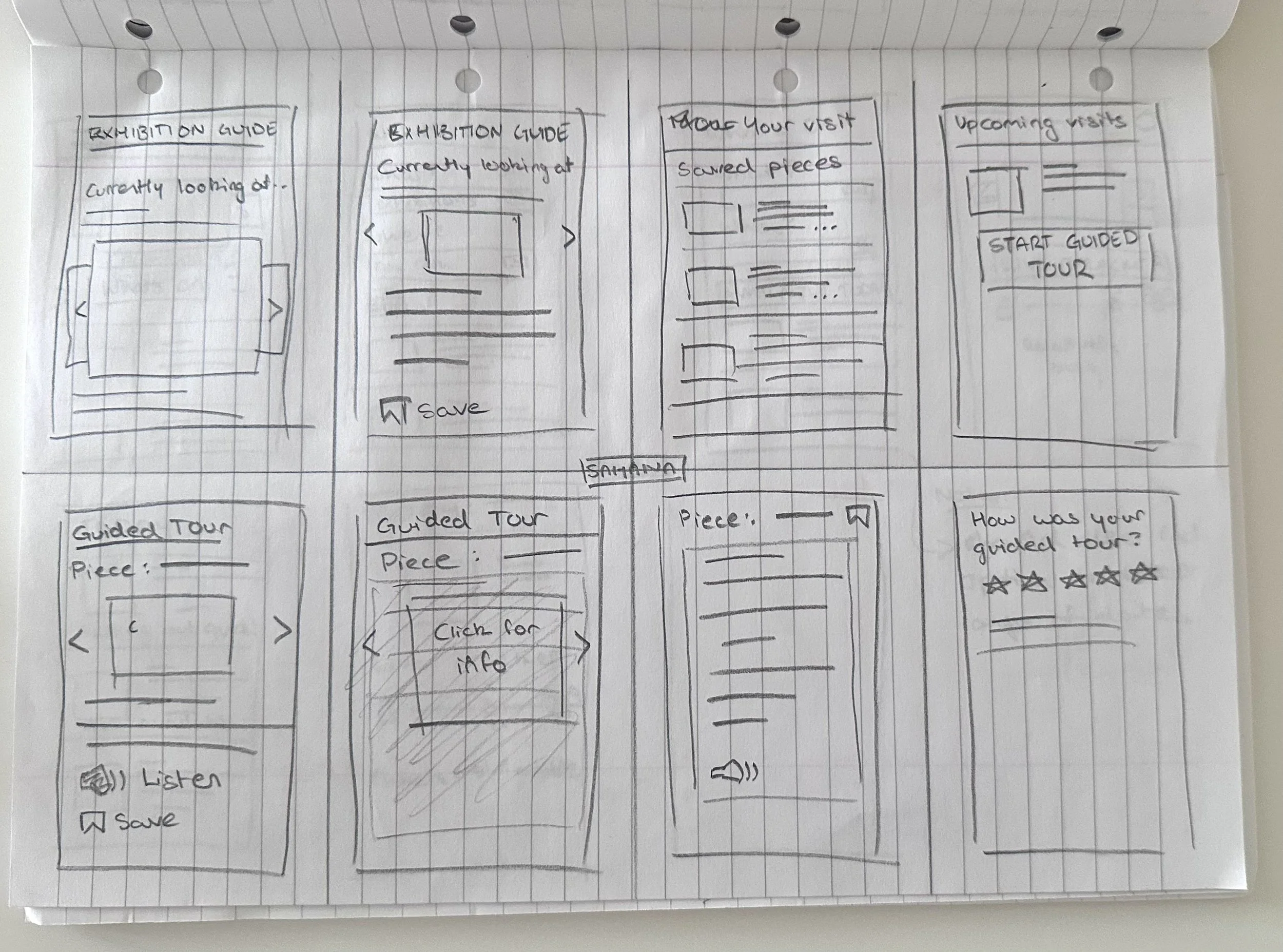
wireframes

I created multiple paper wireframes in order to visualise possible layouts and user flows. After selecting the most effective elements and refining the paper wireframes, I created digital ones on Figma. After integrating interactions, the prototype was ready for testing.


usability tests - round 1
I conducted moderated and unmoderated usability tests where participants had two main tasks to complete:
Book Exhibition 1 for the date 19th of January at 12:30, and
Do the Guided Tour
My goals were to:
Determine if prototype was easy to navigate, and
If booking function was intuitive and easy to understand; I wanted to explore the user flow participants undertook when asked to make a specific booking as there were multiple ways to achieve this.
I observed error rates and time on task to measure the prototypes performance. I would also make notes on participants' behaviour, trying to infer emotions such as confusion.
Main takeaways:
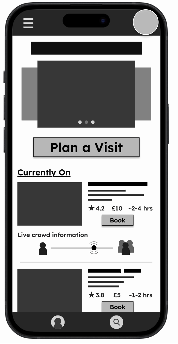
My 'Plan a Visit' booking function was not easy to understand; users would often select wrong items as the filtering options were not very clear.
Users would appear and explicitly expressed confusion, taking a longer time than anticipated when booking
Guided tour received more positively, however, users expressed a desire for a map to help them locate artworks
iterations - round 1
Utilising the feedback, I went back to the drawing board for the 'Plan a Visit' flow. After another 'Crazy Eights' exercise, I eventually settled on adding a supplementary page to make the filtering process simpler and more accommodating for users' specific needs.
Main changes:
I incorporated a 'What's On Today' button that would allow users to see the readily available exhibitions they could spontaneously visit on the day, allowing the app to maintain its 'on-the-go' appeal.
A slide-in menu showcasing thumbnails of all artworks were added to the Guided Tour to allow for easier switching between artworks as well as a map to indicate location

usability tests and iterations - round 2
This time round, bookings made through the 'Plan a Visit' flow were much quicker and led to no errors.
In terms of iterations, the biggest changes were implemented to the Guided Tour where users could now select between a list preview and a map preview based on their preferences.

Personal reflection:
These tests were very insightful for the improvement of my app but also in my personal development as a designer. I initially struggled to not take feedback personally and felt disappointed in my design. It took some time to view this constructive criticism in the way I should have viewed it - as valuable feedback that will help me get better at what I do. Looking back, I can see how because I listened to and incorporated feedback efficiently, there is a world of a difference between my first low-fi prototype and my final low-fi prototype. I feel proud to see some growth in my skills and I now know the value of being positively open to feedback.

branding and colour
My hypothetical museum - The Herne Hill Art Museum - was inspired by my personal affinity for the Herne Hill neighbourhood in south London. I created a colour palette and a logo that would appeal to the local community of young professionals and young families with children. My design is fun and modern whilst maintaining a minimalistic and professional style.

Logo
Colour, text and buttons

These colours were tested for sufficient contrast, compliant with WCAG standards.
final look
All artwork images used in the final prototype were free-to-download, public domain images from the Art Institute of Chicago's website (https://www.artic.edu/). The rest of the photos were from Unsplash (https://unsplash.com/) or ones I had taken personally.

Exhibition search
Search by price


Guided Tour - list preview
Guided Tour - map preview


reflection
what i have learned…
The design process of this app has been a very insightful journey for myself and it was very exciting to take my first steps into UX Design. Reflecting back on my journey, one of my biggest challenges specifically was coming up with an intuitive and practical way for users to easily book visits on the go that would suit their priorities. This, and the guided tour were the most iterated parts of my design but I also believe because of this, they are the strongest selling points of my app. This was only possible because I learned (in a very difficult manner) how to receive and use feedback on my designs without taking it personally. This was one of my most valuable lessons; it is also something that constantly reminded me to keep the users' needs, wants and problems at the forefront of my design process.